Mobile-First Website Design
Mobile-First Website Design
Mobile-first design strategy will ensure your customer based is reached.
Think Progressive Enhancement
Mobile devices are the hardest to design for, but why? First, look at the most obvious indicator, screen size. An average laptop has a 13 to 15-inch screen. The average phone has a 5 to 7-inch screen. Straight and simple, the desktop devices have more real estate to add your design elements, CTA (call to action), and other features.
Another major indicator is functionality. A mouse does not function the same as someone’s finger. The cursor on a desktop is very precise when it comes to clicking on links or buttons. When designing for desktops we don’t need to put much thought into spacing around clickable elements. However, when using a mobile device your finger is not as precise as a cursor. This causes problems with poorly designed mobile experiences that don’t take into account most people browse websites using their fingers on mobile devices. To solve this issue, you must design your mobile website with larger and easily accessible touch points.
When deciding what to add to your mobile website you must think; what are your essentials? This will depend on your business’s specific needs from the website. These items and features must have a purpose to your site visitor’s end goal. Go through each feature and see where they lead you. Will this button lead your visitors to their end goal? Or did it lead to a second step before the end goal? Get rid of the fluff and keep the essentials needed to lead your site visitors to the conversion point. Learn why you need mobile-friendly website.
Forget Graceful Degradation
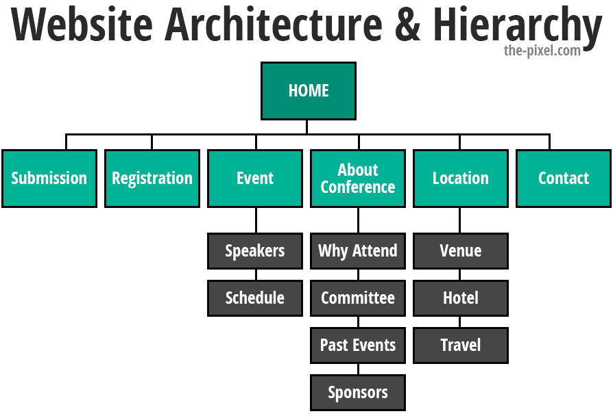
This is your starting point when designing your mobile website. List all the pages along with the features you want to include on each page. This will help create a format for your website.
Develop Hierarchy
Once you have listed your content inventory it is time to rank these features on each page. This will also help with getting rid of fluff. Ask yourself, is this feature needed to drive the site visitor to your end goal or conversion point? If it’s a no, then take the item or feature out or move it down towards the bottom of the page. These less important items not only use valuable real estate, but they also use up precious time with the already short attention span of your average site visitor.

Design your mobile pages
Mobile wireframes are the first step to designing your mobile website. A wireframe is a roadmap for the design of your website and its pages. This will help you visualize what the website will look like without any content.
Move to full designs with mobile functionality in mind
There are a few functions that you must keep in mind when designing for mobile. First, you need larger touch points. As we talked about before, a finger does not function the same as a cursor. People also typically use one hand to hold their mobile device and their thumb to type when using a mobile device. A good rule of thumb (pun intended) is to keep touch targets at least 44 pixels wide and 44 pixels tall and keep at least 10 pixels between each touchpoint. This will allow visitors to click around on your site much easier.
Text should also be large enough to read comfortably on a mobile device. Forcing your site visitor to zoom to read will increase your bounce rate substantially. Remember, you want to give your site visitor the best experience to do what they want to do. If that is read your blogs, make sure your blogs are readable right from the get-go! If they can’t complete their task with only one hand on a cell phone, you may want to reconsider your design.

Remember how I said a finger does not function like a cursor? Well, what is one of the favorite design elements on a desktop-optimized website? Hover and rollover effects! These are great for desktop websites because it adds a level of functionality and design. But within mobile, it’s a click or no click, there is no hover. You must make sure that your links and buttons look clickable right away.
Lastly, pay attention to your images. You may need to use different graphics on mobile devices than on desktop. Mobile devices are generally slower than desktop devices, this means that mobile devices will not handle the same amount of content in the timely fashion a desktop may. To address this issue, you must think about your file sizes. Export your images to the lowest quality that still look great on your website, you’d be surprised how much you can ‘degrade’ your picture before it starts to pixelate. The shape of your image will also play a huge role in your design. Horizontal images will generally not display well on a mobile phone because this image will be shrunk to fit the boundaries, or it will be cropped, and you will not see the whole image.
If you pay attention to these tips, you will be well on your way to creating a functional and impressive mobile website.
Hire ThePixel to build your next website!
Since our founding in 2008, we’ve created and launched many types of business websites. Over the last decade and we’ve learned a thing or two! That’s why we’re masters of our craft, let us help you build the website of your dreams – one that generates traffic, leads and conversions.
Are you ready to start? If yes, contact ThePixel and one of our representatives will guide you through the website phases and how the process works either by a Zoom Meeting or phone.


