How to Improve Website User Experience
How to Improve Website User Experience
Tips to create a positive user experience
Your website is your 24 hour sales person and the foundation to all of your digital marketing efforts. It has to be the best it can be for it to be effective. This business tool has powerful effects on your business if it is built properly. It can help you increase sales, build brand awareness and educate visitors on how you can help them. If your current website isn’t accomplishing these goals, you may need to improve its user experience.
What is website user experience?
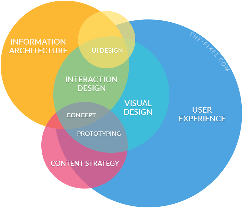
Website user experience, or UX, is the impression left on a person who has visited your website. Did they easily find what they were looking for and left feeling like you helped them out? Or did they leave quickly because your site is unorganized, slow or annoying with too many moving parts?
The goal of creating a quality user experience is to ensure your website lives up to their expectations and that users find value in what you are providing to them. You want to make the time your visitor spends on your website as meaningful and valuable as possible.

According to Usability.gov, for there to be a meaningful and valuable user experience, information must be:
- Useful: Is your content relevant and useful to your visitor?
- Usable: Does your website make it simple for users to access what they need?
- Desirable: Does your website consistently project your brand and appeal to your visitor?
- Findable: Can your visitors easily find what they came looking for? Can search engines access content that can be indexed to make it easier for those searching to find?
- Accessible: Does your website work for people with disabilities?
- Credible: Does your website instill trust in your brand?
Although each of these are important on their own, together they create a website that can satisfy the needs of a broad community of people.
Ensure your website is responsive and mobile-friendly
I’m surprised that I even have to say this anymore, but providing a quality mobile experience is no longer an option. With most people now using their mobile device to search the web, the experience you provide on their mobile phone is more important than ever.
Your website must work flawlessly from a mobile device. Just because something looks great on the desktop, it might not work so well on a smartphone. Remove unnecessary elements, simplify the menu, make buttons large and links easy to click. Be sure to test your website on all devices. There are Chrome and Firefox developer tools that turn your desktop into a mobile viewport so you can see how your site looks on different mobile devices.
Besides the human user experience, how your website performs on a mobile device will affect whether you appear in the search engine results. Google indexes all websites using its mobile first index. Your website design should start with the mobile experience and expand to the desktop, not the other way around.
Keep your webpage layout consistent
Plan your website design elements and page layout ahead of time and stick to them. Inconsistent fonts, colors and page layouts can be distracting. Other design elements like hyperlinks, buttons and social icons also need consistency. If your visitor is spending more time wondering why the pages keep changing or whether bold text is a link, they will feel confused and frustrated. Stay true to your brand identity.
Create a clear and concise navigation
Your website navigation is your table of contents for your website. The structure of your website should be simple and the important information needs to be easy to find.
- Avoid having a navigation that goes more than 2 levels deep and minimize the options to avoid overwhelm.
- Keep all pages at the top level and only use child pages in rare occasions.
- Don’t make it difficult to know what a page is in the navigation. Use common titles for pages like About, Contact or Service Area. The navigation headings can be different from the actual page titles.
Make your content scannable
No one likes to read a wall of text. And no one has time to read everything written word for word. Therefore, writing your content so that visitors can scan it for important items will help them:
- Get the information they need
- Stay on your website longer
- Gain a better impression of you.
Making your content scannable is easy.
- Add more white space. White space is one of the most efficient design elements you can add to your website. It makes your website look modern, open and inviting. It draws your visitor’s attention to the most important content while also making your content more legible.
- Use bullets to help the reader scan quickly. The bullets draw your eye to the content. Using bullets also forces you to organize your thoughts more clearly.
- Use headlines to structure your content hierarchy. Learn how to use the proper headings in your content rather than just bold plain text. WordPress makes it easy for you to select the heading block with multiple choices (h1, h2, h3, etc.).
- Highlight important text. Formatting them in bold or italicized makes them easier to find. But use highlighting for important keywords or phrases that send the message quickly.
Improve the website performance is a virtue, except when surfing the web. If your website loads slowly, most likely your visitors will leave before the page fully loads. They won’t give you a chance to learn about who you are and how you can help. And you may never get that chance again.
Inexperienced website designers or developers sometimes build what’s pretty, not what performs well and helps grow your business. Plus if you use a WordPress theme that includes features you don’t need, it can dramatically slow down your website. Use a lightweight framework like GeneratePress for your theme and add only the features you need.
Some things to look out for that could be affecting your page speed include:
- Images that are not resized or compressed. Many people upload images directly from their mobile devices. These can be several MB in size and will take a lot of resources to load.
- Embedded videos. Sometimes you need to embed a video, but try to upload to a video platform and embed from there.
- Poorly coded or unnecessary plugins. Plugins are a wonderful thing but like everything, you don’t want too much of a good thing. Minimize your use of plugins to those you absolutely need.
- Pop-ups, overlays or too many ads. You want your calls-to-action to stand out, but remember that pop-ups can get your site penalized on mobile devices. If you need to embed ads to monetize your website, be sensible with how many you embed, especially above the fold.
- An inadequate web hosting server. Purchase a hosting account from a company that understands the needs of WordPress.
Users expect websites to load quickly. When it doesn’t, they usually bounce from the site and onto your competition.
Improve the website performance
Patience is a virtue, except when surfing the web. If your website loads slowly, most likely your visitors will leave before the page fully loads. They won’t give you a chance to learn about who you are and how you can help. And you may never get that chance again.
Inexperienced website designers or developers sometimes build what’s pretty, not what performs well and helps grow your business. Plus if you use a WordPress theme that includes features you don’t need, it can dramatically slow down your website. Use a lightweight framework like GeneratePress for your theme and add only the features you need.
Some things to look out for that could be affecting your page speed include:
- Images that are not resized or compressed. Many people upload images directly from their mobile devices. These can be several MB in size and will take a lot of resources to load.
- Embedded videos. Sometimes you need to embed a video, but try to upload to a video platform and embed from there.
- Poorly coded or unnecessary plugins. Plugins are a wonderful thing but like everything, you don’t want too much of a good thing. Minimize your use of plugins to those you absolutely need.
- Pop-ups, overlays or too many ads. You want your calls-to-action to stand out, but remember that pop-ups can get your site penalized on mobile devices. If you need to embed ads to monetize your website, be sensible with how many you embed, especially above the fold.
- An inadequate web hosting server. Purchase a hosting account from a company that understands the needs of WordPress.
Users expect websites to load quickly. When it doesn’t, they usually bounce from the site and onto your competition.
Audit your website for broken links
Although your website isn’t penalized by having broken links and 404 errors, visitors will get frustrated when a page is missing or links are broken. When a user clicks through a link, they expect to find the information they are looking for. Getting a generic 404 error page will cause them to leave.
Broken links happen. Run a website audit or use Google Search Console to find and fix them regularly. Also modify your 404 page to at least provide a list of blog posts or page sitemap available to them. They may just find something else that interests them.

Simplify your message and content
You can do all of the above updates to your site and still present a less than valuable user experience. Your message should clearly and simply tell your audience what you do and how you can help them. One of the biggest website design mistakes small businesses make is to have their homepage be about them, not the audience they are trying to attract.
Spend time working on your message. Then make sure your homepage delivers that message to your visitor. You want to make them feel like you totally understand them and their needs. If you get their interest, they will go to the about page to find out more about you.
Make a good impression from the start
Making a good first impression is important when a new user visits your site. Your website should impress them with the speed, content and design. They should immediately know what you are about and that you will be able to satisfy their interests and needs.
If you are contemplating a website update to help improve user experience, make sure you determine what your audience wants or needs. What content will visitors look for and how easy will it be to find that information. Understand your audience and give them that fast, rewarding and seamless user experience that will keep them coming back.
Hire ThePixel to build your next website!
Since our founding in 2008, we’ve created and launched many types of business websites. Over the last decade and we’ve learned a thing or two! That’s why we’re masters of our craft, let us help you build the website of your dreams – one that generates traffic, leads and conversions.
Are you ready to start? If yes, contact ThePixel and one of our representatives will guide you through the website phases and how the process works either by a Zoom Meeting or phone.

