UX and Agile Website Development a Practical Guide
UX and Agile Website Development a Practical Guide
I’ve been reading lots of articles lately on and rethinking website redesign. Many experts argue for a more agile approach with sprints based on user feedback and statistical website data. And they’re not necessarily wrong.
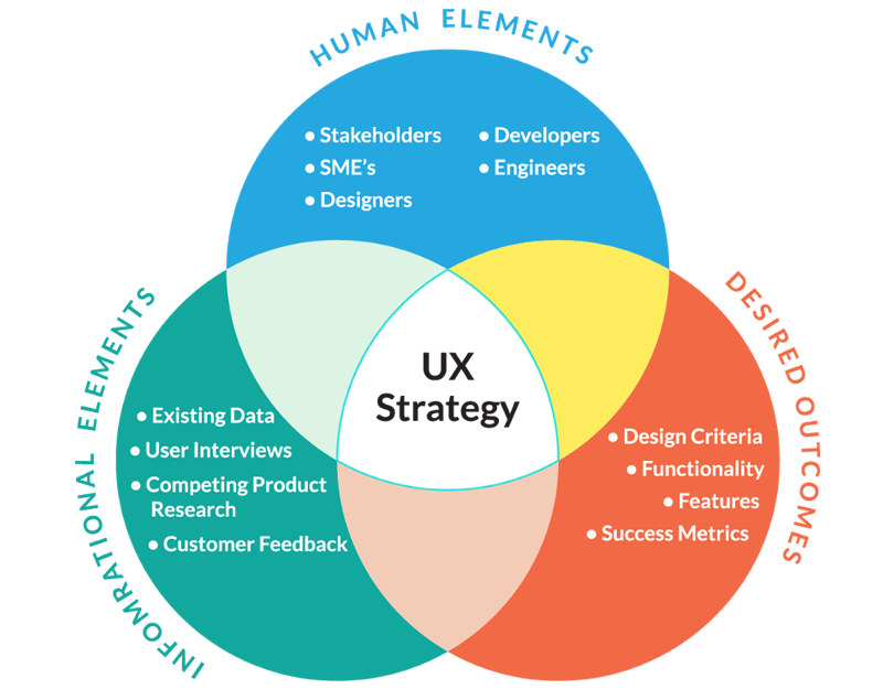
The problem is that many organizations don’t have an agile UX strategy or a person/team to manage it. Many of them are sprinkling in elements of agile into their UX strategies. First, before we jump into the “what to do” section, let’s define a few terms.
User Experience or UX
There are many experts with varying definitions of UX. With that in mind, I really like this definition from Usability.gov, an initiative of the Department of Health and Human Services. They are a “leading resource for user experience (UX) best practices and guidelines, serving practitioners and students in the government and private sectors.”
Here is their UX definition:
“User experience (UX) focuses on having a deep understanding of users, what they need, what they value, their abilities, and also their limitations. It also takes into account the business goals and objectives of the group managing the project. UX best practices promote improving the quality of the user’s interaction with and perceptions of your product and any related services.” Source:Usability.gov
Waterfall vs. Agile Development
Agile is a method some businesses either use or say they use. More often than not, these organizations are using a combo of agile and waterfall methodologies. Let’s look at each…
Waterfall Development
The more common development method is waterfall. Waterfall is a linear development methodology with iterations instead of sprints (I’ll explain sprints in a bit). The entire project has a beginning, middle, and end. Development moves forward following a preset path from start to finish.
Changes in scope in waterfall projects will cause the project to stop, and for deliverables to be amended or changed altogether. This can mean missed deadlines and additional costs.
The main disadvantage to Waterfall is that the project takes what it takes to complete. So, if it takes a year, that’s a year without any return on your investment. The advantage of Waterfall is that you know exactly what you’re building and what it will cost.
Agile Development
Agile is more, well, agile. An agile project runs in sprints. Each sprint has a defined set of goals and a preset timeline. For example, sprint one might be wire-framing, sprint two could be prototyping, and so forth. And each sprint is a shorter length of time, say a week or two.
Also known as rapid development, agile relies heavily on stakeholder availability. Sprints will often involve daily reviews and will certainly require a review at the end of the allotted sprint time.
So, let’s say you’re running two week sprints. That means you’ll need your project team and stakeholders to be available when each sprint ends, every two weeks, at a minimum. And a project could be anywhere from a couple of months to ongoing.
The next sprint does not commence until the previous sprint has been closed. It’s more likely that deliverables from sprint A will end up in sprint B, but only after team/stakeholder review and approval.
With these sprints, the scope is not fixed for the entire project. The scope can be adjusted from sprint to sprint depending on user feedback (if it’s live or in testing) and any user analytics.
But, Agile isn’t for everyone. In fact, very few organizations have the budget or the type of project where Agile makes sense. More on this in a bit.
A Website Is A Living Thing
Now, take what we know about UX and agile and apply that to your website. Your website must meet the needs of your target audience. These needs are likely to be ongoing and often will change based on a number of factors.
In other words, the user experience of your website needs to change and improve based on the ever-changing needs of the user. For this to be a reality, you must be able to change your website easily and often.
Remember UX is “a deep understanding of users, what they need, what they value, their abilities, and also their limitations.”
Does this mean you need to redevelop your website constantly? Of course not. But, you will need to make some major changes from time to time. This all depends on the analytics you’re getting from your website:
- Where are they coming from?
- What are they looking at?
- Are they doing what you want them to?
- If not, what can you change to turn that around?
- How can you build on success and mitigate failure?
- Based on the answers above, is it time for an overhaul? (have you exhausted all options with your current site?)
This is where a lot of companies fall short. They are either not tracking the success of their website or they are only getting a portion of the data available. Marketing with incomplete data will result in less than ideal results.
Here is a good beginner’s guide to Google Analytics.
What Does Website Success Look Like for Your Organization?
Before, during, and after a redesign of your website, you need to clearly define what success looks like. And this should be easy to measure.
More traffic can certainly be a metric to track and improve upon. Traffic is important. More traffic means more opportunities for conversion.
But, what kind of traffic? And how much of it do you need to achieve your goals? A successful website isn’t always one with a lot of traffic. That might sound crazy but think about it this way…
What if the primary foot traffic walking past a butcher shop was made up of vegans? On the surface, it might seem like a prime location. Busy street, lots of foot traffic. But will they come in and buy anything? Nope.
You need to define success and work backwards. If success is a product purchase, work backwards from that.
- What is the product and what makes it desirable?
- Who desires it?
- What are their needs, values, abilities, and limitations?
- Where do they spend their time?
You want more traffic, sure. But, you want the right kind of traffic and you need to “connect” with them. People engage with people. They buy from companies they know and trust.
Again, let’s go back to the HHS UX definition. Specifically, I want to look at your users and “what they need, what they value, their abilities, and also their limitations.”
What Your Website Users Need?
If you can identify and target this, you’re on the right path. There are nice to haves and must haves. You need to figure out how to become a “must have” for your target audience.
If you’re thinking “well, they don’t really have to have it, they might just want it,” stop it! You need to find out what it is about your product/service/whatever that these people need.
For example, let’s say you’re a non-profit organization. One of your target audiences is potential members. Why should they become a member? Just because? Nope, that ain’t gonna cut it. What’s the bottom line? Cut to the chase.
What’s the value of membership as perceived by the target user on your website? This could be advocacy, support, education, etc. It doesn’t matter as much to them that you have 1,500 members. Or that you’re the largest non-profit focused on whatever. That doesn’t hit them in the need zone.
You have to know their pain and understand their unique problems. Then, on the membership page, speak to that.
This applies to any organization selling anything. You could be selling IT services, biotech regulatory consultancy services, handmade ice cream, regulatory requirements for updated tax policies… it doesn’t matter. Your targeted user has a need and you have the solution. You must speak to that need in their language.
What Do Your Users Value?
But, it doesn’t just fall to scratching an itch. Remember, people buy from people they trust. If you have the best solution but you come across in a way that is off putting to your target user, you’re going to struggle with conversion: turning that user into a client/member/consumer.
Recently, I was speaking to a business round-table group about digital marketing. We were talking about perception and how important it is today. Sure, it’s always been important, but now it’s crucial.
When a user is on your website, they are basically a 3 year old with ADD and lofty expectations. That’s an exaggeration but you get the point. They are distracted and certainly not going to block out an hour to read through all of the content on your website.
They will be making a snap judgement when they get your website (to any page from any source because that’s the reality) about whether they’re…
- At the right place – is this what they expected to see when they clicked from Google, Facebook, your email, etc?
- Able to trust you – is this a site they’d feel comfortable sharing their information with?
- Clear on what the next step is – if you’ve ever been to website where you felt overwhelmed and confused, you split, right?
Within a few seconds, they need to feel confident that they’re on the right path. They need to feel that they “like” you. Once they’ve made that determination, you now have an unspoken pact with them. They are invested in you now and will take the time looking around to validate that decision.
The more your website is able to validate their feeling of comfort and confidence, the more likely they are to be willing to do business with you.
What Are Their Abilities and Limitations?
Situational awareness is too often overlooked when developing a user profile and the website for that user. Yes, you need to know who they are, what their needs and values are, and what their pain/problem is. But, you also need to know what their situation is.
Where are they? Are they sitting at a desk? Are they walking down the street? Are they are their laptop writing a blog post with a soccer game on in the background and a dog who doesn’t understand that I really need to be able to move my arms so I can type. Sorry, that might just be me.
You have to understand what type of device they’re using, what sort of bandwidth is available, and what external stimuli is vying for their attention. Now, take a look at your website while mimicking that “situation.” Are things clear and quick to load?
All of these factors play heavily in UX and understanding the user in user experience. Know your user so you can create the most ideal experience for them. They will feel comfortable and will be more likely to convert.
Now, Back to Agile Development
So, now I’ve gone on and on about user experience, but what about agile? Is agile ideal for you? Well, it’s going to be easier to provide a consistently optimal user experience if you’re following an agile style method.
Instead of spending six to twelve months designing and developing a website, only to launch it and realize you made some bad decisions, you’re rolling out updates incrementally. You now have the flexibility to make changes quickly to address any issues with your website.
You can also be more measured with your marketing initiatives. You can roll out a baseline website to start focusing on a core set of features or services. Then, as users interact with your website, you can make adjustments to improve their onsite experience. You roll out features and updates incrementally, at the end of each sprint.
Is Agile Right for You?
Just remember, agile is not for everyone. The process requires money and a lot of management. Each sprint needs to be written out, followed, then assessed at its completion.
And when one sprint ends, you must determine what will be in the next sprint. Is it a combination of tasks not completed, new tasks based on user data, and tasks you had already planned for that sprint? That’s a lot of paperwork and management.
Plus, are you comfortable with an open-ended project plan with an open-ended budget? Sometimes, based on what you’re trying to build, this might be unavoidable. Just know that while agile might be the best fit for what you want to accomplish, it might not be the best fit for your budget or the staff /resources you have available.
So, am I saying that no one with a limited budget should look at agile? No, not at all. But, money is a factor and needs to be considered. If you can’t afford an open-ended project, maybe you can do things in phases in a bit of an agile/waterfall hybrid…
You have a fixed set of deliverables but for a much smaller portion of the project – just enough to go live with something. Then, after some real data comes in you look at starting phase two.
Which development methodology is going to deliver success? Is it agile? Waterfall? Or some combo? (of course Agile purists will hate the idea of a combo, but they don’t have to pay your bills!)
Digital Marketing Today
Marketing today is about user experience. The user is now in control. They hold the cards. And the best marketing is the kind that consistently and effectively meets and exceeds the needs of the user while achieving conversion goals.
A traditional waterfall approach may tie things up unnecessarily and force you to miss opportunities. Yes, you can make updates to your website on a regular basis once it has gone live. But, think of all the time you wasted on developing a feature that was never used or didn’t help you achieve your goals.
With agile development, you are nimble enough to pivot quickly, make course corrections based on real usage, and avoid spending too much time on things that simply will not work.
So, is agile right for your project?
- Do you need to roll out a project quickly? Can you develop and deploy is smaller chunks?
- Are you uncertain about the total requirements for the project? In other words, can you confidently map out all deliverables in one doc and be certain that they will not need to change? If not, then agile might be the way to go.
- Do you have the necessary staff to manage an agile process on your end? Someone to work with developers and project managers to ensure the project stays on track? Sprint by sprint?
Again, there’s nothing wrong with waterfall. It’s still a very common and effective development methodology. And, no matter what agile purists say, you can mix elements of agile and waterfall into a project plan that meets your needs within your budget.
Hire ThePixel to build your next website!
Since our founding in 2008, we’ve created and launched many types of business websites. Over the last decade and we’ve learned a thing or two! That’s why we’re masters of our craft, let us help you build the website of your dreams – one that generates traffic, leads and conversions.
Are you ready to start? If yes, contact ThePixel and one of our representatives will guide you through the website phases and how the process works either by a Zoom Meeting or phone.
