Top Webpages for Your Website
Top Webpages for Your Website
If you’re a business, your website is likely the most important sales and marketing tool in your arsenal.
Your prospective customers are doing their due diligence, and your B2B website plays a critical role in their evaluation strategy.
So what pages must you absolutely include on your website?
There are many, depending on the nature of your business, but in this article, we’re boiling it down to the top three. Keep in mind, these are not the ONLY three pages to include, but think of them as your “desert island” pages. If you could only pick three, these are the ones I’d recommend.
1. Home Page (aka: Your Digital Storefront)
This may sound like a no-brainer, but it had to be mentioned. The homepage is the most important page on your B2B website and typically the most visited, so it should make an impact.
Acting as your “digital storefront,” it’s the first impression your prospect has of your business and quickly lets them know if they want to explore further. Your homepage should convey high-level information about who you are, what you do, and your unique value proposition.
Remember the goal for your homepage is not to tell your entire brand story. Instead, it should pique the reader’s interest enough to dive further into your B2B website to learn more about your offerings and if your solution would be a good fit for them.
On the other hand, your homepage shouldn’t be too sparse, either. You want to provide enough information to get the reader excited about your solution. Some components might include:
- Overarching brand message: This should include an attention-grabbing headline and some brief information about your brand and what makes it unique.
- High-level benefits: How will your audience benefit from using your solution?
- Products or services: It’s a good idea to tease these on the home page, so your audience understands in practical terms what your deliverables are.
- Credibility-builders: Testimonials, case studies, and client logos impart third-party validation that helps to build credibility.
- Thought leadership: Educational content, like blogs and white papers, establishes you as an expert in the field.
- Calls-to-action (CTAs): Always give your readers multiple opportunities to get in touch with you, download content, or get more information.
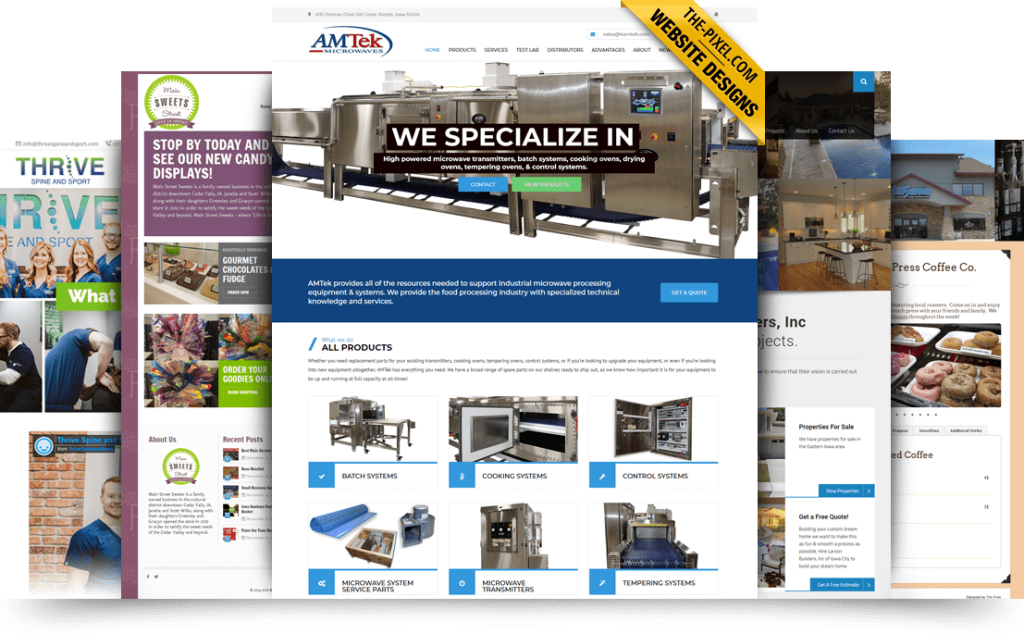
The trick here is to keep each of these sections concise and to the point. Mention a few benefits, then prompt the user to learn more with a link to full benefits info. Tease the results of a case study, then include a link to read the entire story. You get the gist.
Your home page should be a highlight reel designed to engage the reader to dig deeper. Don’t give it all away on one page.
2. Products or Services Page (aka: The Crux of the Matter)
The second most important page in your B2B web design is your Products or Services page. We consistently see that, apart from the homepage, this page receives the most traffic. In most cases, each individual product or service you offer should have its own dedicated page and be easy to navigate to.
Your audience wants to do their homework and check out what you’re offering before they reach out to you to discuss details. And what you say here matters – 65% of B2B buyers cite vendor websites as one of the most highly influential sources of content.
Your Products or Services page should answer a few key questions:
- What your product or service is?
- What it does?
- How it will benefit the target business?
- How it is different than your competitors?
You’ll want to consider your audience’s pain points and how your offering can help solve these problems for them.
It’s also a good idea to include relevant credibility builders here – perhaps a testimonial or case study from a client who has benefited from your product or service. You can also include related thought leadership content – possibly a white paper, video, or infographic they can download in exchange for contact information.
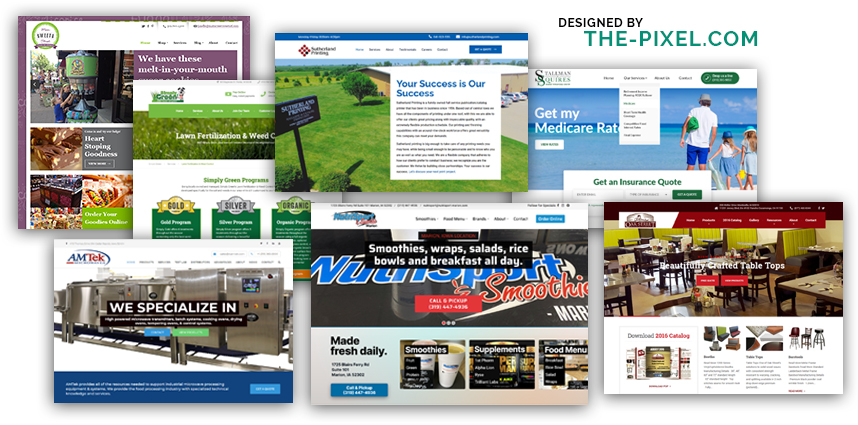
Remember, not everyone enters your B2B website on the homepage and then clicks every other page. Some might enter on a subpage like this, so it’s OK to repeat some elements from the homepage in case they missed them. In marketing, repetition is a good thing!
3. Contact Page (aka: Get That Conversion!)
You may have thought I was going to name the About, Resources, or Industries page in this list. While those are indeed important pages to include, the Contact page supersedes them all.
Have you ever been to a website and spent more than a few seconds searching for how to get in touch with that business? Yeah, it’s frustrating – an emotion you don’t want your prospective customers to feel when visiting your B2B website.
Your Contact page should be easy to find, so include it prominently on your navigation, as that is the place most folks will look. I also recommend including a link to it in the footer, because you never know how an individual navigates your site.
Content on your Contact page should be brief. Your prospect has made the decision to get in touch with you, so make it easy for them. We typically recommend some friendly copy inviting them to reach out, then a short form to complete.
Remember: the shorter the form, the more likely the user will fill it out, so limit form fields to only what’s truly needed – your sales rep can always fill in the rest during a one-on-one chat with the prospect.
Be sure to include an address and phone number as well. A physical address establishes credibility not only with your site visitors – but with Google as well. Also include a phone number, because there may be readers who need help right away, or they just prefer speaking to a real, live human.
Hire ThePixel to build your next website!
Since our founding in 2008, we’ve created and launched many types of business websites. Over the last decade and we’ve learned a thing or two! That’s why we’re masters of our craft, let us help you build the website of your dreams – one that generates traffic, leads and conversions.
Are you ready to start? If yes, contact ThePixel and one of our representatives will guide you through the website phases and how the process works either by a Zoom Meeting or phone.
