10 Landing page mistakes you should never make
10 Landing page mistakes you should never make
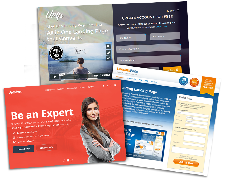
Landing page design is a serious process and it demands a lot of precision and hard work
Modern companies from all sizes are investing into content driven marketing. Marketers are struggling to create better and more amusing content than their competitors, all while hoping they can show tangible results for their efforts. To show results, you need to have conversions. And in that capacity, success all comes down to success of your landing pages.
If you are not able to come up with a great landing page, the odds of driving conversions and making a profit are minimal. This is why you must to hire a website design agency like ThePixel to create a flawless landing page while driving traffic and converting traffic to sales.
If you choose to create your own local landing page(s) you will need to learn the basic principles of the landing page design. Just as importantly, you also have to know what not to do. That’s why we will show you 10 expensive landing page mistakes you should never make.
1. Slow load speed
One of the most frequent reasons for high bounce rates is the loading speed. Namely, customers hate waiting. You will chase them away if you have a slow-loading landing page.
A recent study proved that a one-second delay in page load time decreases conversions by 7%. Optimization is crucial in that regard. Start by compressing and minimizing all content and images on the landing page. If that doesn’t work, maybe you should even give your hosting a second thought.
2. Poor design
The landing page speed is only one of its characteristics. The second one is design-related: users don’t want to see an ugly page.
Poor design can significantly hinder performance, so put some time and creativity into it. If you already made a few landing pages, I suggest you test each of them using heat maps. It’s a very convenient tool which can help you to analyze every single move of every single visitor on your landing page.
Heat maps provide you with valuable metrics, and they also provide you with an outstanding visual presentation of user behavior.

3. Boring headlines
According to some studies, the landing page traffic can vary by as much as 500% based on the headline. Since users are not really into reading that much, they will probably leave the page in case you don’t grab their attention immediately. This is why you need to come up with interesting headlines.
4. Low-quality copywriting
You’ve probably realized by now that landing pages (and marketing in general) rely on imagination and creativity. This is especially the case with copywriting, so please don’t allow yourself to use dull phrases and buzzwords. Take a look at the following examples of remarkable landing page copy to give you a clue.
5. Using boring, redundant stock imagery
You should never neglect the importance of landing page images. They are easy to remember and have the potential to skyrocket conversions.
Perhaps you think that stock photos are great. Let us tell you one thing – such images are fake, and users will know it. Instead of this, you should create your own photos to reveal the value of your products or services. It will pay off very soon, so don’t skimp on the budget for it.
6. Using worn out calls-to-action (CTAs)
A well designed CTA will make potential buyers more interested, and it is likely to increase the number of conversions. But if you use old-fashioned CTA solutions (such as “Order Now!”), you may not inspire a lot of purchasers to proceed with your offer.
Try to be more creative or offer some sort of benefit to catch the visitor’s attention. For instance, Basecamp invited users to start a free trial, which is always a good selling proposition for interested customers.
7. Stuffing the pages with ads and pop-ups
When users choose to visit your landing page, it already suggests that they trust your services. Don’t disappoint them immediately with pushy pop-ups.
Let them breathe and explore your offer first. Then let the pop-ups do their job.
Today, almost 70% of users would block a site from search results because it has too many ads. We know you have to earn something on the side but it’s not your primary business after all.
8. Failing to tailor landing page content
What you choose to include in your landing page content should depend on the nature of your business. But some companies use the same landing page for a wide range of purposes.
You should avoid this mistake and focus on content that suits your preferences – e.g., is it a B2B or a B2C landing page? In each case, you can present different content. For B2B, there are always eBooks, Analysis, and Free Trials. On the other hand, B2C usually offers surveys, tutorials, discounts, etc.
9. Overlooking and omitting testimonials
Word of mouth marketing is more influential than ever! Around 90% of customers tend to buy things they see recommended by real people as opposed to other brands. For this reason, you absolutely should make it a point to include testimonials on your landing page. This will help prove your credibility in front of prospects for your product or service.
10. Forgetting the importance of mobile visitors
With more than 2.3 billion smartphone users worldwide, it is not at all difficult to explain the importance of mobile optimization. Unfortunately, a lot of marketers still neglect this issue and don’t adapt landing pages so as to fit mobile experience.
You need to act more carefully and design a user-friendly interface. This way, you’ll improve the mobile UX and increase your chances of better converting people who visit from a phone, tablet, or other mobile devices.
Conclusion
Landing page design is a serious process and it demands a lot of precision and hard work. In this article, we described 10 expensive landing page mistakes that you should never make in your business.
If you found value in this blog post, please share with your friends and followers. It only can take one small but important lesson to make a big difference!
Hire ThePixel to build your next website!
Since our founding in 2008, we’ve created and launched many types of business websites. Over the last decade and we’ve learned a thing or two! That’s why we’re masters of our craft, let us help you build the website of your dreams – one that generates traffic, leads and conversions.
Are you ready to start? If yes, contact ThePixel and one of our representatives will guide you through the website phases and how the process works either by a Zoom Meeting or phone.

