How-to improve your website’s user experience
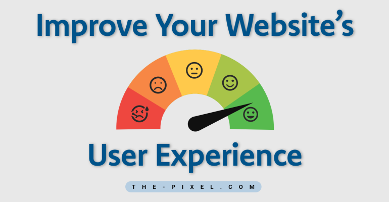
How-to improve your website’s user experience
Tip #1 Use white space
Just think about it – if this entire article was one big paragraph, what are the odds of you going through it? In fact, what are the odds of anyone going through it? Slim, right?
How you put down your words isn’t the only thing that is going to make your text visually appealing. The blank space between your images, paragraphs, and other media is also critical. That’s what is commonly referred to as “white space.” Shocking, right?
However, it is very important to achieve a proper balance. Too much white space can end up causing the user to feel as if the website is unfinished. Too much text can overburden them. Just make sure that you convey the message in a proper way without pumping too much text into it.
Tip #2 Keep your pages consistent
When we say consistent here, we mean that everything needs to match. The choice of your fonts, the sizes of your headings, coloring, spacing, overall design elements, button, illustration styles, and pretty much everything you can think of – it should all align.
Everything needs to be themed properly in order to add up to one coherent design which translates throughout the entire website, not only on one single page.
Drastic changes from one page to another can easily cause your users to feel lost. After all, they should always know that they are browsing through your website.
Tip #3 Website animation – it helps
Website animation has become a very popular concept mainly because people respond to visuals more than they do to text. While not everyone would admit it, most would watch the movie instead of reading the book.
There are plenty of techniques for modern animation website designs you can take advantage of. However, the important thing here is, once again, to keep things well balanced.
You can’t afford to have your whole site animated – it just doesn’t work this way. Animation is great when it’s well-placed and well-made.
Tip #4 Identify your 404s
Now, it’s true that search engines won’t penalize you dramatically for having soft 404 errors here and there. These are the “page not found.” However, your users will.
When a user approaches a link and he clicks on it – he’s expecting something. Whether it’s a video or a picture or just another page of information – he’s waiting for it.
Do you remember how when you were little and your parents said they’d take you to the Zoo on Saturday and then as the day finally came, it was raining? That soul-crushing feel – you must have felt it. While it’s not that bad, it’s at least half way there.
404s can easily destroy your UX. The last thing you want is to leave your users unsatisfied at this particular point in their journey.
Tip #5 Optimize your page speed
This one probably goes without saying but one of the most irritating experiences for users is waiting for a page to load.
Mobile devices are on the rise and people re accessing content throughout the world from a range of different platforms. This means your website has to be ready for it and properly optimized for all kinds of occasions.
Five seconds of page load time can effectively increase the bounce rate of your website by more than 20%. That’s massive. You don’t want to be missing out on 1 of every 5 users because your site is slow.
Get your score – there is a free tool offered by Google. The best thing about it is that it would also provide you with necessary suggestions to make sure your speed is increased. However, working with a professional on the matter is likely to be the better call.
Tip #6 Be mobile-friendly and responsive
We’ll repeat it – mobile devices are on the rise. People consume a lot of the information on the internet through their smartphone, tablets, and whatnot. Hence, you need to adapt – to respond.
That’s why we say that your website has to be responsive. It means that it must be able to respond to different types of loading devices.
Users are at least five times more likely to abandon your website if it’s not optimized for mobile devices. Hence, optimizing it would give you so much more value and benefits.
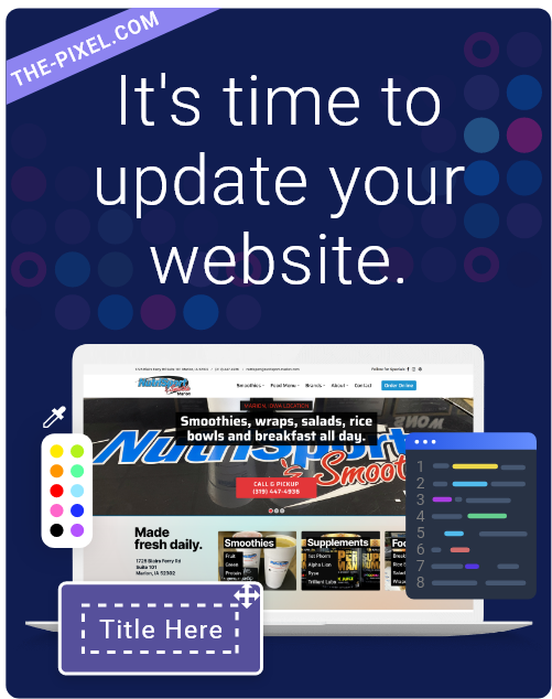
Hire ThePixel to build your next website!
Since our founding in 2008, we’ve created and launched many types of business websites. Over the last decade and we’ve learned a thing or two! That’s why we’re masters of our craft, let us help you build the website of your dreams – one that generates traffic, leads and conversions.
Are you ready to start? If yes, contact ThePixel and one of our representatives will guide you through the website phases and how the process works either by a Zoom Meeting or phone.
