How web design impacts your customers’ online experience
How web design impacts your customers’ online experience
Creating the best online customer experience for your website visitors
Web design is one of the most important aspects of a customers’ experience when viewing a business’s webstore. Whether looking for a product or a service, customers tend to wish for ease-of-use and accessibility across devices first and foremost, but there are multiple other aspects to consider when designing your website. In fact, just looking to the design of a webpage can automatically improve its function and, in turn, bring more visitors to your page. More visitors potentially means more customers!
1. Appearance
When clicking on a webpage, you obviously create a first impression of it. Now this impression is also said to be the last impression; after all, who wants to continue browsing a website that isn’t attractive to the eye? Design doesn’t need to be complex, but it does need to be both current and up-to-date so that visitors actually enjoy browsing.
Here are four simple ways to improve the appearance of your site:
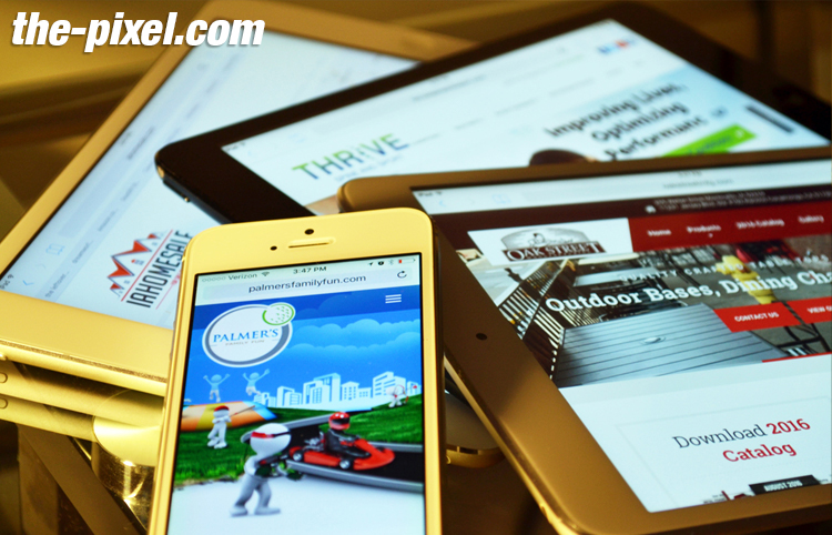
- Responsive Design: Ensure your website is responsive and looks great across any device, whether it be on a small smartphone screen or a larger desktop computer screen.
- Bold Fonts: Ensure you have easy-to-read fonts on your site. It may seem boring, but they can help to give the reader the most value from your words without having to strain their eyes.
- Eye-Catching Images: Create visuals to summarize the text for those visitors who wish to absorb all information quickly and easily. Sometimes it’s good to have a large full-width graphic at the top of the page!
- Multimedia: Make good use of videos, images and features/interactives to break up the block text. Used correctly, multimedia can really make sure that visitors are converted to customers!
2. Professionalism
Similar to appearance, your web design can actually show how professional your business is. Your visitors need to feel happy that they are dealing with a reputable business before they convert.
Make sure that your audience knows exactly how trustworthy your company is by adding a few simple elements:
- Culture Page: Add a page which talks about your company’s approach to daily operations along with any values or traditions that you have.
- Photos of Staff: Show visitors who the real people are behind the site, who they might be contacting, or even show them images of staff at work. Ensure that visitors know that you are a thriving business!
- Customer Results: Showcase the great feedback given to you by previous customers in order to convert those potentials!
3. Clarity
The importance of clarity is simple; your users should be able to find exactly what they are looking for as quickly as possible. This is usually improved within your navigation tools, and can be very simple to adjust.
The two most significant ways of improving clarity on your website are:
- Breadcrumb: Based upon the idea of the way Hansel and Gretel used breadcrumbs to find their way back home, this aspect of web design means that when your visitor clicks on a new link, you must ensure that there’s a link back to the previous page so that they can go back whenever they want to.
- Drop-down Menu: Easy to implement but super helpful, a drop-down menu can bring all your content into categories, making it easier to find!
4. Load Times
In order to rank high in Google, your page must have a quick load time. Aside from this, visitors will thank you! In an age where mobile devices are prevalent, web browsers want pages that load quickly and only take up a small amount of data.
Here are two quick and easy ways of improving your webpage’s load times:
- Optimism Image Size: Make your image size smaller! You don’t have to risk the quality of your images though; using .jpeg files means that your images are smaller but still high-resolution.
- Remove Auto-Play: If a visitor comes to your page and is bombarded by videos or audio that automatically plays when they load it up, they may just turn around and leave your page as quickly as they came! Auto-play can be irritating and can use up data quickly on mobile phones, so it’s best to leave that off.
5. Conversion
Finally, the main aim of your web design is that of conversion rate improvement. Thriving online, whether you’re selling products or services, means converting visitors to customers!
Below are three things to keep in mind when designing your webpages:
- Color Scheme: Use your color scheme to highlight calls-to-action so that visitors can see them clearly. If they can see them, they can use them!
- KISS: This means ‘Keep It Simple, Stupid’. Don’t use busy backgrounds or cluttered designs. Use simplistic, modern, and attractive designs to allow your visitors to see clearly.
- Faces: Human faces can help visitors to relate to your business, rather than feeling as though everything is computer-generated. You can use stock photography if you want to, but if you use images of your own staff, it’ll make visitors more comfortable in contacting you.
So, as you can see, there are numerous simple ways to ensure that your web design caters to customers and gives them reassurance that you are a reliable company. All of these aspects contribute to the amount of traffic visiting your page, which in turn helps to boost it to the top of search results in those all-important search engines! More visitors ultimately means more conversions and more sales, so it’s worthwhile implementing some, if not all, of these tips to help reap the rewards right away. Good luck!
Hire ThePixel to build your next website!
Since our founding in 2008, we’ve created and launched many types of business websites. Over the last decade and we’ve learned a thing or two! That’s why we’re masters of our craft, let us help you build the website of your dreams – one that generates traffic, leads and conversions.
Are you ready to start? If yes, contact ThePixel and one of our representatives will guide you through the website phases and how the process works either by a Zoom Meeting or phone.
