3 Things Every Good Mobile Website Needs
3 Things Every Good Mobile Website Needs
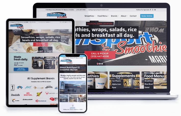
When it comes to a proper mobile interface, opt for a “less is more” approach.
By now, you know you need a mobile-friendly website. As basically every indicator points to the fact that mobile browsing is only becoming more and more prevalent, mobile-friendly website is one of the most important investments a company can make.
But as you make the decision to create and move forward with a mobile site redesign, you may find yourself wondering: What does a mobile-friendly website really need? What makes a great mobile-friendly website, and what should you prioritize as you go through the design process?
1. Simple Interface
Let’s define what your mobile-friendly website needs by identifying what it doesn’t need.
- Pop-ups
- Flash
- Java
- Copious advertising
- Too much text
What do all of these things have in common? They’re cluttery and they may derail visitors from using your website at all.
Your mobile user doesn’t need to be streaming a lot of video. They don’t need to be using a separate form to sign up for your email blast. They certainly don’t need to read three pages of “About” descriptions. What they do need is a way to find your physical store, a list of products you offer, an easy way to browse and shop, and a very clear button that allows them to contact you.

When it comes to a proper mobile interface, opt for a “less is more” approach. If there’s a lot of content you really, really want users to be able to access, make it easy for them to switch to the desktop view from their phone—and make sure that’s optimized, too.
2. Matched Branding
Though a mobile site should be much more than just a simpler version of your homepage, you still want it to look like you.
Users who land on your mobile-friendly website only to find different colors, logos, fonts, or other branding elements may be confused and bounce out. Make sure that when they click through, they get exactly what they expect from your brand—and a landing page that smoothly leads them through the functions of the rest of the site.
Similar iconography, colors, and even features will help users know that they’ve ended up in the right place, effectively lowering your bounce rate and ensuring that your mobile-friendly website is doing its job.
3. Functional eCommerce or Contact Forms
Regardless of what you’re offering, your site needs to have a good way for potential users to buy it, request it, or at least reach out.
A good mobile-friendly website needs to have a clear call-to-actions for users to engage with you and your products. And while it may seem tricky to create a functional eCommerce website on mobile, it’s actually fairly simple—and can lead to major conversions.
Even if your company doesn’t actually sell anything, you need to be prepared for users to want to contact you directly through the website. An easy contact form—one without a lot of tiny fields the user has to tap on and fill out—or other methods of communication (read: not something that has to pop up into their email or another app) is an essential way to ensure that your mobile-friendly website is inviting and that you’re leading customers through the funnel in a way that makes sense for them.
Hire ThePixel to build your next website!
Since our founding in 2008, we’ve created and launched many types of business websites. Over the last decade and we’ve learned a thing or two! That’s why we’re masters of our craft, let us help you build the website of your dreams – one that generates traffic, leads and conversions.
Are you ready to start? If yes, contact ThePixel and one of our representatives will guide you through the website phases and how the process works either by a Zoom Meeting or phone.


