Mobile UX design – Tips to improve user experience
Mobile UX design – Tips to improve user experience
Mobile-first indexing
Web designers typically design for desktop viewers when creating website layouts. But, while there’s no doubt that a sleek landscape layout is vital, statistics show that mobile, landscape-viewed sites surpass desktop searches in volume and market share worldwide, according to Statcounter.
Even search engines like Google themselves are using mobile-first indexing to serve users the best content on-the-go, knowing all-to-well that smartphones and tablets are the way our generation gets its information.
Now more than ever, user experience (UX) is at the forefront of mobile design. Let’s review eight ways you can use this form of design to better serve your audience on smaller screens:
1. Get a responsive website
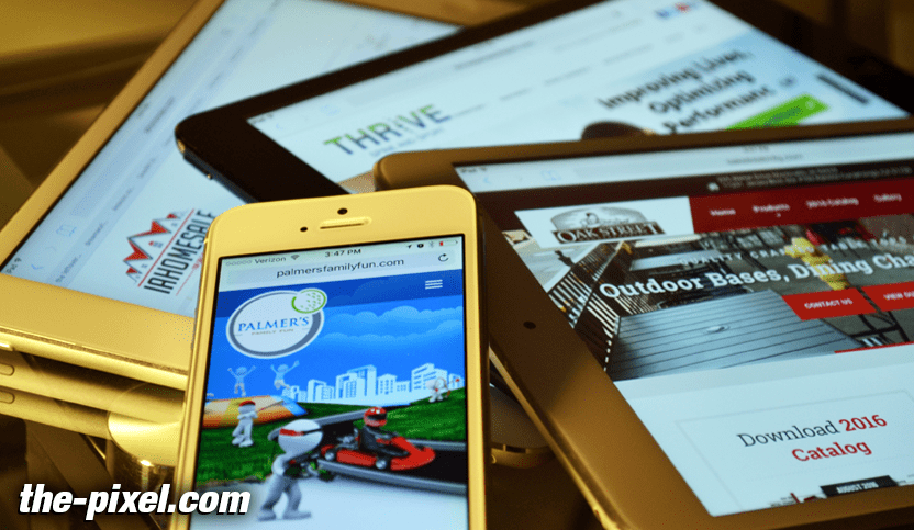
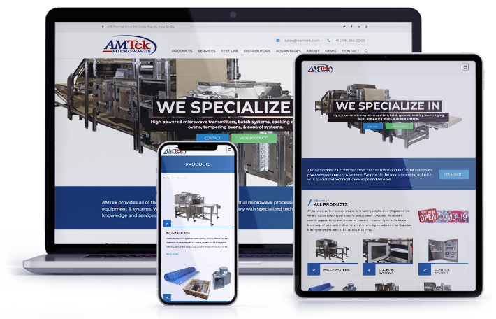
One of the easiest ways to make your website mobile-friendly is to your website responsive. In simplest terms, this means that your site will look great no matter what device it’s viewed on, as your content can adapt to nearly every screen size.
Oftentimes, this requires changing your domain’s theme to a responsive website layout and can involve a bit of an initial overhaul. But for many, this initial effort is well worth it in the end, since there are tons of solid reasons switching to responsive benefits them— many of which are connected to creating a better user experience.
If you click the linked article, you’ll see how responsive design can help to lower bounce rates, foster better conversions, and increase your revenue. And it’s no wonder why! Who doesn’t hate pinching and zooming to read text on a webpage that isn’t mobile-friendly or dealing with dysfunctional forms that aren’t modified for the cellular experience?
Remember, Google and major search engines love a website that provides a great user experience for its searcher, which is why search engines actually prefer responsive websites. Responsive sites can be crawled faster, which leads to quicker load times. They get you more mobile traffic, which is crazy important if local SEO matters to your brand.
2. Shorten your forms and use touch controls
No one likes a long form, but this is especially true when using a smartphone or tablet. If your lead generation strategy involves gated offers, consider cutting the form down for those using mobile.
Mobile experiences should always be quick and easy for users, and no one wants to spend more than a few seconds filling out a form. Make it super simple for them by only asking for a name and email— or, use a smart CRM that can detect previous information captured by that contact and autofill a few form fields.
Make sure your forms are reactive to switching to mobile in functionality as well. Touch controls that allow your users to easily toggle between dates, times, etc. are great for filling out birthdays, scheduling appointments, and more.
3. Remove or better optimize your images
Images are often the largest-sized items on your webpage, and these powerhouses can be a big snag to your mobile experience. If your images take too long to load, this can increase your load time. Google only wants to serve webpages on mobile that load quickly for users searching on-the-go, and will often not serve slow-loading, non-AMP-friendly pages.
Even Google itself says in regards to images, “Users search on Google Images more from mobile than on desktop. For this reason, (it’s) important that you design your site for all device types and sizes,” which loops back to our point above to make sure your website is responsive! But having a responsive site isn’t enough; you also need to practice healthy image optimization.
For an improved mobile experience, upload the best image size recommendations, file types, compression, and more by reading our article on optimizing your images for the web. Or, for the mobile version of your site, consider removing certain images completely for faster load times.
4. Add big, shiny CTA buttons and make your text bigger
If you want your mobile user to take some sort of action on your page, make their conversion click abundantly obvious. Large call-to-action buttons are great for finger clicks; so make sure the touch area is an appropriate size for pressing by previewing it before publishing.
Use enticing, actionable language to get the user to click and make it pretty by using attention-grabbing, on-brand colors. Don’t forget to keep it high on the page too so your visitor doesn’t have to hunt for it! Learn more about the psychology behind a great CTA here.
In general, don’t forget to enlarge your text size for mobile users too. Use at least 11 point font size for iOS users or 14 points for Android, as best practice.

5. Perfect your navbar
On a desktop version of your website, your navigation bar is easier to use. Plus, as marketing guru Neil Patel points out, it eats up valuable real estate on a smaller smartphone screen. Responsive website templates should be able to compress your navbar into a hamburger, accordion-style layout neatly tucked into a corner of your user’s screen— which is much easier to expand and navigate than your conventional strip for mobile users.
Notice how in our screenshot above, you can see how our mobile menu expands to take up the whole screen and includes clickable plus signs for viewing sub-links within each main bucket.
But that’s not the only way you can design a mobile navigation menu! In this example from The Good, you can see how Frank Body’s mobile-friendly webpages use a sticky product categories menu at the bottom to make navigation easy on a smartphone. This article also includes some great tips for creating a friction-free site search experience, which is especially useful if you sell products vs. services.
6. Keep it simple
Keeping your website clean and lean is important for desktop viewers too, of course, but it’s crucial on mobile. When you start adding too many elements to a page— filling it with crazy textures, images, too many words, colors, etc.— it’s painfully obvious on smaller screens.
Avoid clutter by making sure your mobile view has some whitespace. Just think of the iconic Google search home page, featuring a giant white screen with a small, colorful logo and neat and simple search bar.
Another incredible idea to keep in mind is only showing your viewers the information they need when they need it, and not overwhelming them with what’s ahead. This is the concept of progressive disclosure and is a key component of many video games. Tell a story as your viewer scrolls down your page, instead of trying to make too much above the fold.
7. Integrate a conversational marketing or live chat feature
Save your searcher the hassle of hunting throughout your mobile site by having integrating live chat options on your mobile site. This will enable searchers to get fast answers, either from your sales team or from an intelligent virtual assistant.
If you’re going to use chatbot technology, it’s important that your responses are short and sweet for mobile, since long, complex messages will be more frustrating to read through on a small device, and could hinder the space they need to navigate your website while still chatting with your assistant.
8. Get user interaction feedback
The best way to improve your user experience is to ask your users what they think! Before launching a responsive, mobile-friendly version of your website, host feedback sessions to gather reactions from a select few customers. These testers should be a diverse yet accurate representation of your target audience.
Record them as they interact with your mobile site on various phone types and tablets. You could even have the person conducting the exercise ask the users a series of questions aimed at improving the mobile experience. Don’t forget to leave some open-ended, asking things like, “What do you like about this page of the mobile site?” or “What don’t you like about it?” This is where users will talk freely and give you the most to think about.
Take this feedback and discuss it internally, making necessary changes to your mobile site before launch. Or, at least make the highest impact changes first, and continue to revise in the months to come as your new site is live— a process that us inbounders love, called growth-driven-design.
Improving your user experience for mobile users is really about making your site leaner, cleaner, and meaner!
While creating a mobile-friendly version of your website may very well be the best route for your time and budget, creating a mobile application can often help you achieve a similar goal, with better results.
Hire ThePixel to build your next website!
Since our founding in 2008, we’ve created and launched many types of business websites. Over the last decade and we’ve learned a thing or two! That’s why we’re masters of our craft, let us help you build the website of your dreams – one that generates traffic, leads and conversions.
Are you ready to start? If yes, contact ThePixel and one of our representatives will guide you through the website phases and how the process works either by a Zoom Meeting or phone.
