Web design usability mistakes
Web design usability mistakes
Build for the users, not your preference
Visual cues are a great way to increase conversions on your B2B website or landing page.
Every B2B website should be designed with the user in mind. This will ensure that the conversion goals are met.
It doesn’t matter how long you have been running your business, if you can implement the web design best practices as laid out in this post, you’ll boost your traffic, acquire more leads, and grow your sales exponentially.
While there are several ways to increase your conversion rate, the very first part to pay rapt attention to is your website design. Remember, it’s the first thing your customers will meet when they get to your website.
1. Too much focus on the homepage
Your homepage may be easy to navigate and look professional, but what about the other pages of your site? In many cases, users may not even see your homepage, instead landing on inner pages from search engines or social media links. This is why it’s crucial to spend an equal amount of time on the usability of every page on your website.
2. Lack of hierarchy
When looking at a web page, it should be obvious where you want users to look first, second, third, etc. Otherwise, people will struggle to make sense of the page. To ensure users focus on your key messages in the right order, you need to effectively use font sizes, colors, and layouts that help people figure out what the most important information is.

3. Hidden navigation
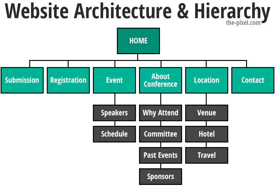
Creating a site structure. The design trend for parallax scrolling and other techniques doesn’t always impress users who are simply looking for information. It may look good, but when it comes to site usability, navigational links should still be easy to find.
Creating a site structure that makes sense to users is key. Links should be labelled correctly, describing exactly what type of content users will find after clicking on a link. Too many websites use poorly labeled links, which means users struggle to find the right path to the content they’re seeking. If links lead to different pages with related content, the solution could be to consolidate content so that it all falls under just one link.
Links that resemble advertising are also a common usability mistake, with users skipping content that has an added design element, such as a border or background color. To avoid confusion, avoid adding unnecessary design elements around a link. Alternatively, use simple graphic symbols alongside text to highlight its meaning, such as a telephone icon to show where to go to for contact information.
4. Information overload
Filling pages with walls of text makes it incredibly difficult for users to locate the information they need. Remember that users scan content, so you need to use enough white space to break up blocks of text, write shorter paragraphs, and use bulleted lists, headings, and bolded keywords to make it easier for users to find what they’re looking for. This is even more important for e-commerce product pages, where users are looking for specific information about a certain product.
5. “Secret” contact information
Many websites fail to show their contact information prominently on the web page. You at least need a dedicated “Contact Us” page link in the main navigation bar. Many visitors will be looking for a way to contact you. Make it easy for them to do so!
6. Inconsistency
Consistency in design means ensuring similar elements look and act the same. If your first subheading is Arial in dark grey with a 16-point font size, the rest of the subheadings should be the same. Are your hover effects all the same? Do links have the same color? With proper planning, you can make sure your design remains consistent and users have a better experience.
7. Non-Responsive design
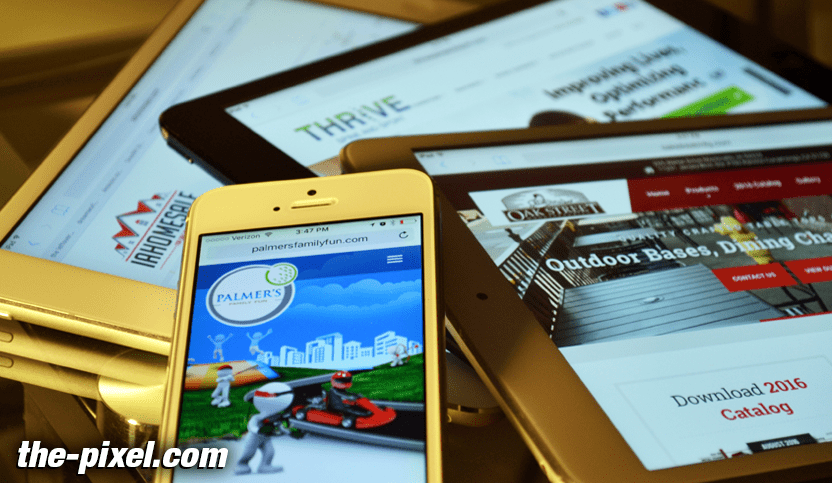
A recent study by ComScore and Millennial Media reported that around 56 percent of online content is viewed on smartphones. Businesses cannot afford to ignore the rise of mobile, which means responsive design should be a priority for every business. It’s not only crucial in terms of the user experience, it’s also essential for SEO.

While design trends come and go, the fundamental needs of website visitors remain the same: users need to find information easily, without distractions. Don’t worry if you’ve made any of these errors; they’re common in web design. If you remember that usability is ultimately more important than looks, and you focus on your users’ needs, you can avoid many of these design mistakes.
Hire ThePixel to build your next website!
Since our founding in 2008, we’ve created and launched many types of business websites. Over the last decade and we’ve learned a thing or two! That’s why we’re masters of our craft, let us help you build the website of your dreams – one that generates traffic, leads and conversions.
Are you ready to start? If yes, contact ThePixel and one of our representatives will guide you through the website phases and how the process works either by a Zoom Meeting or phone.
Are you ready to start? If yes, contact ThePixel and one of our representatives will guide you through the website phases and how the process works either by a Zoom Meeting or phone.

