Think Mobile-First When Designing Your Website
Think Mobile-First When Designing Your Website
Mobile-first website design for your business success
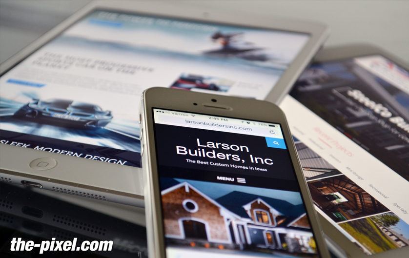
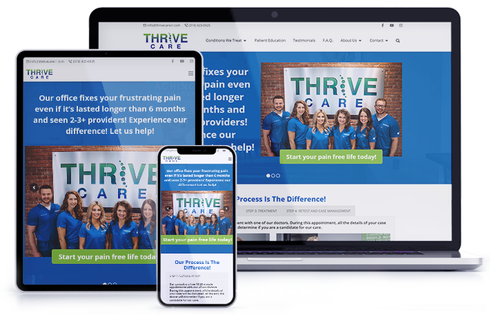
Mobile-friendly website design should be a top priority to ensure that your visitors have the same user experience across the board from a smartphone, desktop or a tablet. There’s nothing worse than viewing a poorly rendered website on a mobile device and struggling to read overlapping text with cluttered images that run off the page.
In 2015, 31% of people viewed websites on their mobile devices. As of December 3, 2019, records indicate that it’s as high as 51%. With a little over half of the web traffic worldwide using mobile devices, mobile design is no longer an afterthought.
Aside from potentially poor aesthetics in mobile view, it’s now imperative to have a mobile-friendly website in order to rank in Google. As of July 1, 2019, Google announced that “all new websites previously unknown to Google Search” will be indexed using mobile-first indexing. In other words, Google now crawls and indexes your website based on how it renders on a mobile phone versus a desktop computer.

What Does This Mean for My Existing Website?
For older websites, Google will continue to monitor and evaluate pages for their mobile readiness (as in mobile-friendliness) and will move these sites to mobile-first indexing. Readiness is based on Google’s best practices for mobile-first indexing. You can read a detailed definition of Google’s best practices for mobile-first indexing on their developer site. I suggest you keep this link bookmarked because they have a Changelog of announcements on this page.
It’s important to know if your site is mobile responsive. A quick way to check is by using Google’s mobile-friendly test tool where you type in your website URL to see if there are pages that need fixing and what issues are detected.
Test While You Build
Whether you are building or redesigning a website, you need to test for mobile responsiveness. Besides the obvious way of testing which is to type your URL into a smartphone and review every page, there are several other ways to do so as well.
It’s a good habit to check each page and fix as you build rather than at the end which can make for more work and needless troubleshooting.
Think Progressive Enhancement
When deciding what to add to your mobile website you must think; what are your essentials? This will depend on your business’s specific needs from the website. These items and features must have a purpose to your site visitor’s end goal. Go through each feature and see where they lead you. Will this button lead your visitors to their end goal? Or did it lead to a second step before the end goal? Get rid of the fluff and keep the essentials needed to lead your site visitors to the conversion point. Learn why you need mobile-friendly website.

Another major indicator is functionality. A mouse does not function the same as someone’s finger. The cursor on a desktop is very precise when it comes to clicking on links or buttons. When designing for desktops we don’t need to put much thought into spacing around clickable elements. However, when using a mobile device your finger is not as precise as a cursor. This causes problems with poorly designed mobile experiences that don’t take into account most people browse websites using their fingers on mobile devices. To solve this issue, you must design your mobile website with larger and easily accessible touch points.
Hire ThePixel to build your next website!
Since our founding in 2008, we’ve created and launched many types of business websites. Over the last decade and we’ve learned a thing or two! That’s why we’re masters of our craft, let us help you build the website of your dreams – one that generates traffic, leads and conversions.
Are you ready to start? If yes, contact ThePixel and one of our representatives will guide you through the website phases and how the process works either by a Zoom Meeting or phone.


